Exploring GA4 Analysis: A Hands-On Guide with Datasets
Published on May 02, 2024
When I embarked on my quest to find suitable datasets for demonstrating marketing/web analysis, I encountered a surprising roadblock—there seemed to be a scarcity of relevant datasets. However, a stroke of inspiration struck me: why not utilize the data from my portfolio in Google Analytics 4 (GA4)? While contemplating the idea of purchasing data online, it dawned on me that sharing my data, coupled with a basic guide on analysis, could serve as a valuable resource for data enthusiasts.
Admittedly, my GA4 setup lacks extensive tracking, but this analysis has not only enlightened me on the potential for further data integration but also underscored the importance of sharing this blog based on the insights gleaned.
I'll be exploring four key segments: User, Traffic, Page, and Event reports. Additionally, I'll provide downloadable sheets containing the results. But before diving into the analysis, here's a quick prelude:
Before We Begin:
- Load all datasets into separate sheets within the same spreadsheet you can download datasets from here.
- Cleanse the revenue and conversion columns, as this blog pertains to a non-e-commerce website where conversions aren't tracked.
- Lets dive into the analysis.
1. User Acquisition:
Which channels are most effective at acquiring new users? What are the demographic characteristics of these users?
1.1 Unveiling User Engagement:
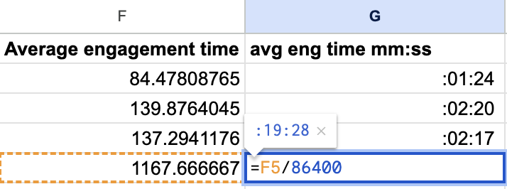
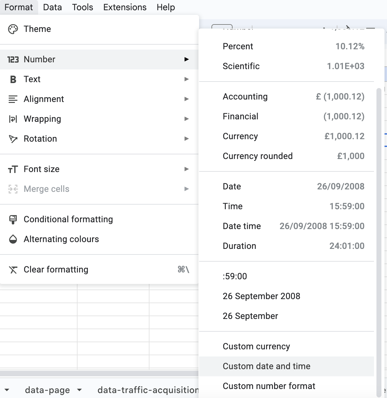
Before constructing pivot tables, let's convert our time values into a more user-friendly format. Utilizing Google Sheets' functionality, I transformed seconds into minutes. This involved dividing values by 86,400 to account for the fraction of a day each second represents. With a new column named "Avg Eng Time mm: ss," I formatted the cells to display time in the "mm: ss" format.
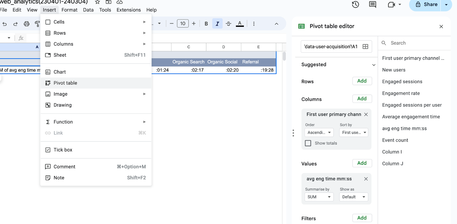
1.2 Constructing Pivot Tables:
In a new sheet named "report-user," I organized our data for clarity. Selecting the appropriate sheet and range, I structured the pivot table, cherry-picking columns and values to extract actionable insights.
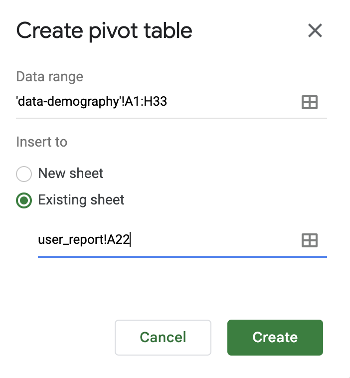
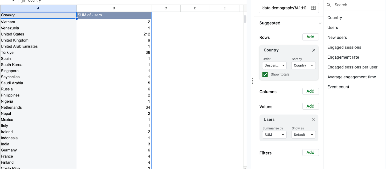
1.3 Delving into Demographics:
For a deeper dive into user characteristics, I harnessed the power of demographic data. Within the "report" sheet, I crafted pivot tables to dissect demographic trends, carefully selecting rows and values to enrich our analysis.
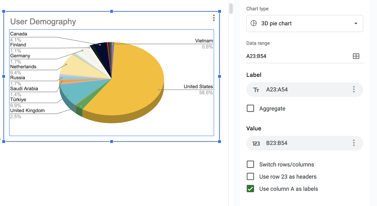
Now, it's time to visualize our findings. Let's navigate to the "Insert" tab and select suitable chart types to complement our analysis.
Select your preferred chart type from the "Insert" tab, highlight the relevant data range, and insert the chart for visualization, followed by customization for clarity.
For engagement time analysis, I used two types of charts:
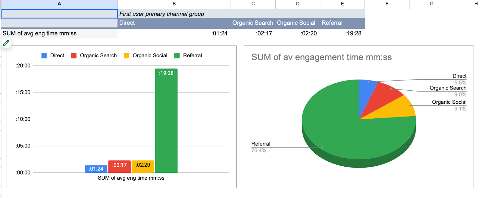
User Insight 1: Sharing my portfolio more on data community platforms seems like a good idea, especially given the high demand for reports from the referral channel.
Below is a 3D pie chart illustrating demographic data analysis:
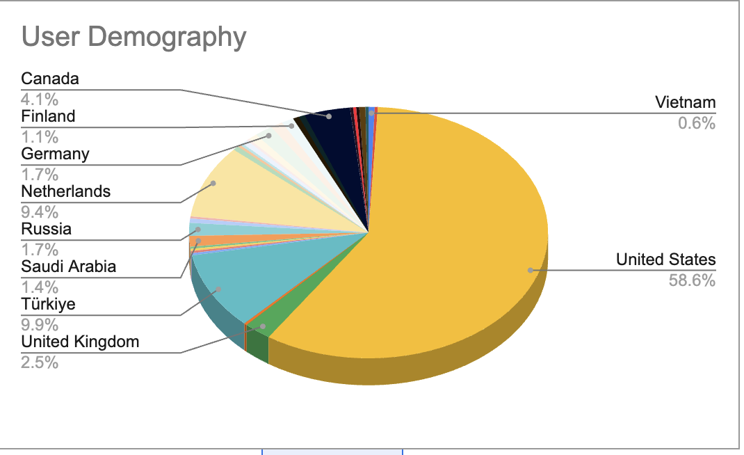
User Insight 2: The United States takes the lead in demographic data, which is particularly delightful for me since I have a fondness for its beautiful cities—especially NYC and San Francisco, both of which I even have posters of, evoking the same sentiment! 😊
2. Traffic Acquisition
How do different traffic sources contribute to overall site traffic and user engagement?
Following a similar methodology, I first calculated the average time spent per session in a new column. Then, I proceeded to create a pivot table and corresponding chart to delve into the insights.
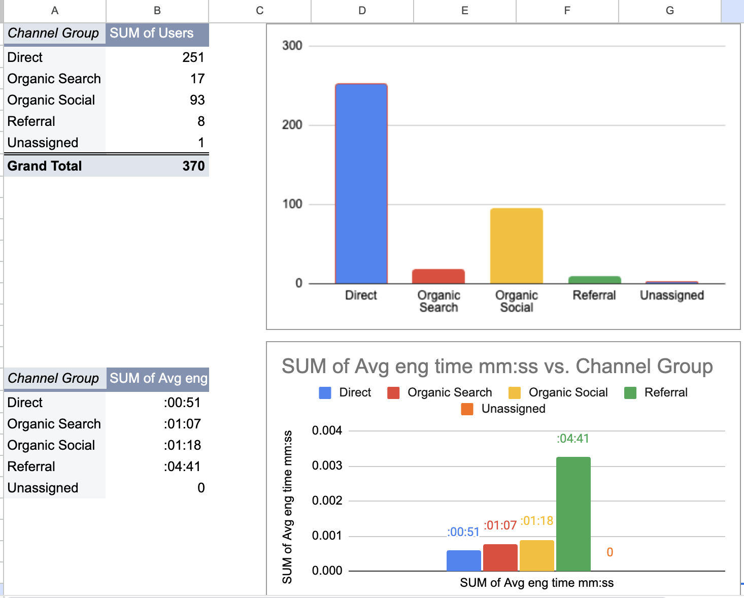
Traffic Insight: Different traffic sources contribute uniquely to overall site traffic and user engagement. While Direct traffic accounts for the majority of users, Referral traffic stands out with notably higher engagement times, indicating diverse patterns of user behavior across channels.
3. Page/Screen Report:
What are the most visited pages/screens on the website? How do these pages contribute to user engagement and retention?
Following a similar approach, I began by creating a pivot table and subsequent chart to dissect the data.
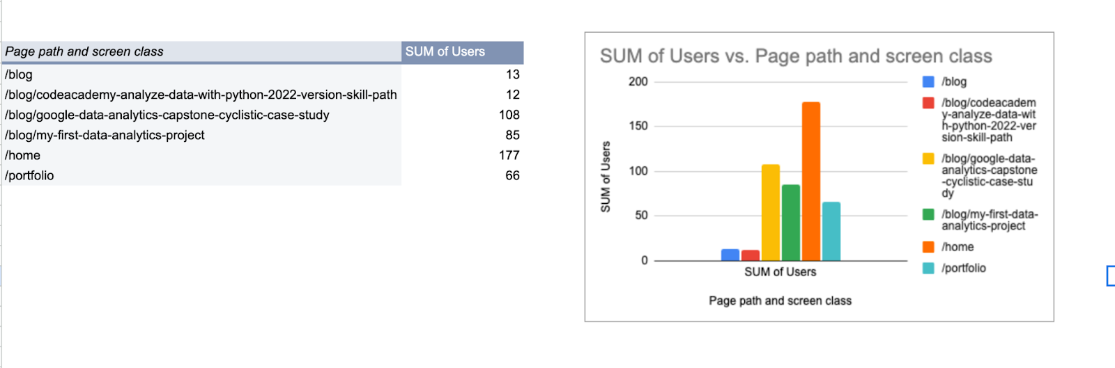
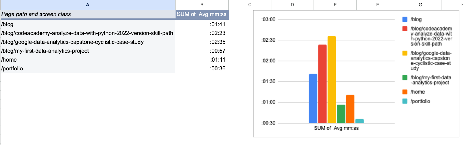
Page/Screen Insight: My blogs rank highest in engagement, which serves as a delightful confirmation of the good decision to write this blog.
Additionally, I've mapped the project pages separately. This will enable a detailed analysis of page visits, facilitating insights into the popularity of individual projects.
4. Events Report:
What specific actions are users taking on the website? How do these actions correlate with overall engagement?
Employing a similar methodology, I began by creating a pivot table and subsequent chart for analysis.
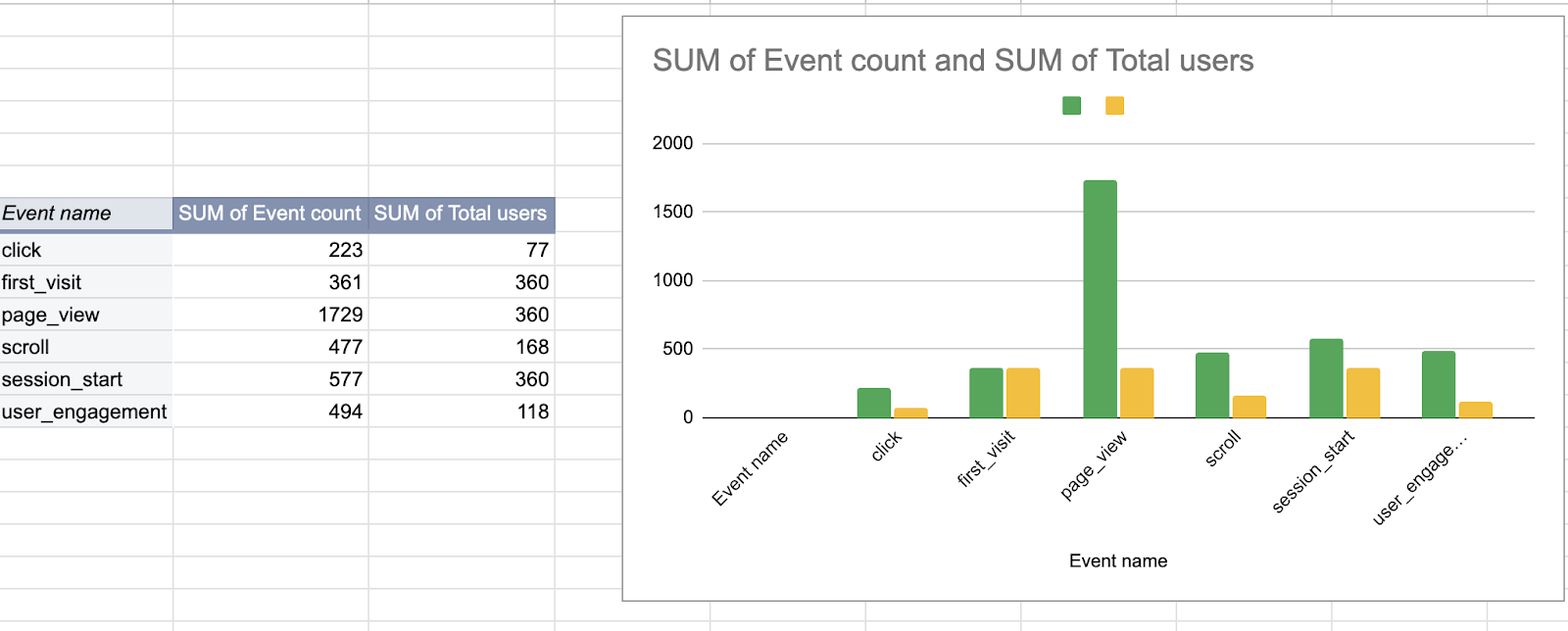
Event Insight: It's exciting to see users actively exploring my site, showing genuine interest in the content. When visitors initiate sessions, it's a clear sign that they're engaged with what the site has to offer. Although the number of page views is impressive, there's room to enhance user interactions. By adding more Tag Manager tags, I can gain better insights into user behavior, helping me understand engagement levels and click metrics more accurately. As a result of this analysis, I'll take action to beef up the tracking capabilities of my website by adding more tags.
Final Thoughts
As we wrap up our analysis, feel free to download the spreadsheets containing the answers here. However, I recommend attempting the analysis yourself first, as it offers valuable hands-on practice. Should you encounter any challenges along the way, you can refer to the answers provided. I hope this guide provides you with a practical understanding of GA4 analysis. For future projects, I plan to explore Python more, as I miss working with it and find it the most enjoyable way to practice data analysis. Stay tuned for upcoming projects!
Feel free to reach out to share your insights or comments—I'm always eager to hear from fellow data enthusiasts.
Happy exploring!